Playing with Fire

I have been soooo busy the last few months on things that required my absolute focus – such as making my wedding dress, teaching, and preparing for an upcoming solo exhibition. I was literally up to my eyeballs in yards and yards of ivory silk, wool and cream, and I discovered some truly wonderful people and places in the process. I am now returning more full-time to the world of paint just when spring has begun in the most glorious fashion, and I am hoping that I will have a little more time for writing about painting.


The Palace of Donn’Anna, Naples, Jules Coignet 1843

Henri Carr - Vesuvius in Eruption, March 1944
Naples - Vesuvius by Kajetonas Sklėrius (1876-1932) 12 x 17 in. watercolor, 1929
Joseph Wright of Derby. Vesuvius in Eruption, with a View over the Islands in the Bay of Naples. c. 1776-80. Oil on canvas. 122 x 176.4
Gustaf Soderberg View of Vesuvius from the Bridge of St-Januarius, Naples 1820 National Museum, Stockholm

One of the images constantly in my mind’s horizon is that of Mount Vesuvius, my next-door neighbor. For those of you who have never been to Naples and have heard rumors about how “dangerous” it is, be aware that the real danger is Vesuvius – a silent fountain of “rebirth” from which gushes the thrills, the fire, the dust, the goosebumps and the chaos that form Naples today, a modern city perched on a delicate historical tapestry. The experience is invigorating and intoxicating for an artist, a true adrenalin rush similar to that first enormous crush. But when in Naples, do as the Neapolitans do: Don’t worry about it. Let it overwhelm you, and in the meantime, if you can concentrate on getting some decent painting done, someday someone might really appreciate it.

Here below are some images/fantasies inspired by the presence of this potent volcano, a little tribute to “playing with fire.”

This slideshow requires JavaScript.

Artists featured in alphabetical order include: August Wihlem Julius Ahlhorn, Henry Brokman, Achille Carelli, Henri Carr, Franz Ludwig Catel, Edward William Cooke, Jules Coignet, Christopher DiPietro, Johan Christian Claussen Dahl, Robert Dukes, Robert S. Duncanson, Jacob Philipp Hackert, Alessandro La Volpe, Heinrich Reinhold, Charles Remond, Kajetonas Sklėrius, Gustaf Soderberg, Joseph Mallord William Turner, Pierre Jacques Volaire, Michael Wetzel, Joseph Wright of Derby, Michael Wutky

Sophie Jodoin: Exposure of Truth

I came across some additional images of Sophie Jodoin‘s earlier works this past week, and it happened at a time when I really felt like I needed to see something that speaks of blunt honesty. I have been thrown a lot of curve balls during my experience in Israel, so it is consoling and encouraging to look at an artist that attempts to expose the learned truth, straightforward without agenda or masks, focusing on the victims rather than the crazed protagonists.


From The Fallen (revisited) series, 2006

Jodoin has explored numerous difficult themes over the years, particularly the violences in war, children, relationships, growing up and aging, as well as the feelings of numbness, nostalgia, fear, rejection, and aspirations that accompany these very facts of human existence. Around 2003, and certainly by her Fallen (revisited) series in 2006, Jodoin chose to remove color altogether from her work, to strip “away the sensuality of color often associated with painting,” as she put it. The 2004 series “A Little Red Suite: the World is a Heartbreaker” – oval portraits of grief in red – were thus followed by the black and white documentary type explorations of Drawing Shadows (of her mother) and Diary of K., and since then Jodoin has consistently stuck to the raw, graphic power of black and white.


From A Little Red Suite – the World is a Heartbreaker series

Is she perhaps better skilled in black and white than color? I might say so, but then again it has been hard to find more than a few earlier works in color to compare. Reality has its base in black and white, existing before the cones and rods of the eyeball, and color does impassion our moods unwillingly – just imagine if food were only in black and white. Certainly, the lack of color in her work over the last several years lends more severity, coldness and objectiveness to the analysis, and thus is more suggestive of a documentary approach on the human condition. It also serves to curb any of those who dare classify Jodoin as a political artist; the removal of optical color also takes out any of the cloying color of politics. At any rate, I like pretty much anything she does, in any hue or tone.


Study for Homicide, date unknown

She always knocks the wind out of me, because the images have a violence in contemplation rather than in surface – a jolt of exposure that is needed, in my opinion. It is too easy to go about our day ignoring, neglecting or simply being unaware of other currents and people around us. We are so “busy.” It is only when unfortunate things happen in our own back yard that we stop for a moment and begin to fully question the horrors of being human. Sophie Jodoin paintings function like universal backyards for the viewer. Though artists tend to notice things others may not, in many of her series, Jodoin chooses to make the likeness of a person unrecognizable while focusing instead on the realism of recognizable props, which can sift out an undercurrent of emotions that perhaps we had never considered before. We do not recognize a random soldier, but we recognize the bandages of war. We may not relate to a toddler’s face, but we can relate to a faceless young girl clinging to a bunny.


From the Ward Series 2008-09

Jodoin allows us views of people who – by a rare slip of circumstance – are not us, but could be us in a split second. We should not be fooled that we are better or more fortunate than anyone else simply because we are standing on the other side of the glass. Instead, we can absorb these works as exposures of the fragile, haunting truthfulness of life, and we can walk away more equipped to proceed with life, with more knowledge and compassion.

Born in 1965, Jodoin lives and works in Montreal, having earned her BFA from Concordia University in Montreal in 1988. Represented by Battat Contemporary and Newzones Gallery of Contemporary Art, she exhibits regularly throughout Canada, the US and Europe. Her website provides a thorough investigation of her work and bibliography since 2004. There is a also a beautiful filmed interview (in French) of Sophie and her work.

Exhibition: Antonio Lopez Garcia


Photo of Lopez Garcia on the streets of Madrid by Oscar del Pozo

This slideshow requires JavaScript.

If you have not yet been able to make it to Madrid this summer for the major retrospective of Antonio Lopez Garcia at Museo Thyssen-Bornemisza in Madrid, the Museum makes it a little easier to cope with through an excellent online virtual tour through the exhibition. The virtual exhibition walks you through the ten rooms of Lopez’ development, thematically displayed in categories of Memory, Surroundings, Madrid, Gran Via, Trees, Nude, Characters, Interiors, Food, and Projects. The new six curvilinear perspective paintings of Gran Via, talked about in the El Pais 2010 interview below, are displayed in progress, as well as a recent landscape view of Madrid, his newest flower paintings and sculptures of his grandchildren. The phenomenol show opened on June 25 and will be up until September 25, 2011.

Closed on Mondays, the Museum recommends early booking to the limited entry exhibition.

You can buy the soft-cover Spanish exhibition catalogue here online, with 176 color illustrations and 45 black & white ones for about 30 euros, but only if you have a Tax/VAT #.


Some of the works on exhibition, and others I love looking at:

Stephanie Pierce Solo Show in Boston

This slideshow requires JavaScript.

Stephanie Pierce will be opening a solo exhibition at Alpha Gallery in Boston next weekend, April 16 from 3-5 pm. The show will be up through May 11, and I recommend going out of your way to see these new works. Pierce’s paintings are stunning visual trips for those who get to see them in person, a reward of intimate colors and forms that she has found by coming to that fork in the road and opting for the road less travelled. For closer looks of her paintings, please visit her excellent website.

The Coolest Way to Crack an Egg

With Easter and Passover approaching, eggs are appearing everywhere. I have also been working on a number of little quick sketch paintings on panel, which I will post soon. So today this got me to thinking about Duane Keiser, and I went over to visit his blog, A Painting a Day. To my great delight, I found the following video where he “cracks” an egg in the marvelous magic trick known as oil painting. I appreciate it greatly because it shows terrific skill in painting abstractly from observation while having “fun” at the same time.

Pathways to Landscape Exhibition – Curated by Dean Fisher

On a recent trip to the US, I had the enormous privilege to meet and talk at length with the artist Dean Fisher. An accomplished artist and gifted teacher based in Connecticut, Fisher recently put together “Pathways to Landscapes,” an extensive exhibition of landscape paintings by 25 contemporary artists at the Ridgefield Guild of Artists. As a survey of this nature and size is so rare today, I recommend that you run over to visit it before it closes on Saturday, March 26.

Fisher received the request to curate an exhibition after being awarded the Best in Show at the 33rd Annual Juried Show of the Ridgefield Guild of Artists. The artists he selected for inclusion – Robert Bauer, Frank Bruckmann, Hollis Dunlap, Nicholas Evans Cato, Eileen Eder, Dean Fisher, Josh Gaetjen, Christopher Gallego, Israel Hershberg, Diana Horowitz, Alex Kanevsky, Constance LaPalombara, Claire Maury-Curran, William Meddick, Lawrence Morelli, Artie Mihalopolous, Lenny Moskowitz, William Nathans, Josephine S. Robinson, Stuart Shils, E.M. Saniga, Jesus Villareal, Justin Weist, Brian Wendler and Jordan Wolfson – represent his consideration of some of the most cherished paintings available for collecting today: “If I were a collector, these are the works I would own.” Special lending arrangements were made with several galleries such as DFN Gallery, Forum Gallery, Steven Harvey Fine Arts Projects and Marlborough Gallery in New York, as well as with the artists to bring such an extensive exhibition to the public, including two or three representative works per artist. For those who cannot travel to Connecticut to see the exhibition, the following slideshow of photos provided by Fisher will offer a good peek.

This slideshow requires JavaScript.

Dean Fisher is a contemporary classically oriented realist painter and has shown at Hirschl & Adler Gallery and Tatistcheff Gallery in New York. A highly respected teacher and exquisite painter of stillife, landscapes and the nude, he is a guild artist and instructor of painting at the Silvermine Arts Center in New Canaan, Connecticut and conducts workshops in Italy during the summer, including the new landscape painting program at the Certosa di Pontignano from August 27 – September 3, 2011, with details of the course yet to be announced.


Fisher, Beach-Windy Day


Fisher, Tide Pool

To view works of the selected artists in the exhibition, websites have been provided here when available:
Robert Bauer
Frank Bruckmann
Hollis Dunlap
Nicholas Evans Cato
Eileen Eder
Dean Fisher
Josh Gaetjen
Christopher Gallego
Israel Hershberg
Diana Horowitz
Alex Kanevsky
Constance LaPalombara
Claire Maury-Curran
William Meddick
Lawrence Morelli
Artie Mihalopolous
Lenny Moskowitz
William Nathans
Josephine S. Robinson
Stuart Shils
E.M. Saniga
Jesus Villareal
Justin Weist
Brian Wendler
Jordan Wolfson

Walking in the Rain


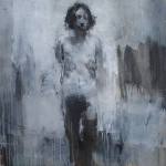
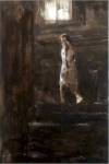
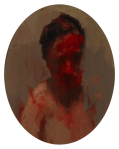
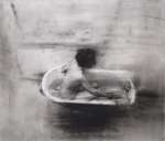
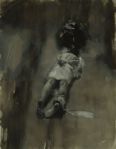
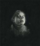
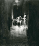
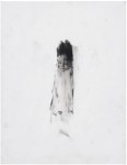
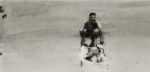
Felice Carena, “La Perla”

For the last ten days, I have had the pleasure to sit down at cafe tables or a panel discussion and talk about painting. In general, I don’t find it very satisfactory, nor do I have the burning desire to talk about paintings, especially mine. It already is a constantly devastating experience to realize on your own that what you have created is, in essence, a stupid painting. Well, much of the time, at least. And this realization causes you to wonder just what is it that you long to paint and why.


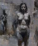
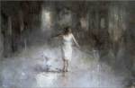
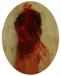
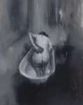
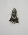
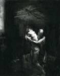
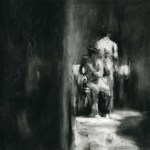
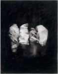
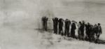
Jennifer Meanley, “The Reluctant Bride”

Talking about painting, and now writing about painting, can sometimes be a verbal, therapeutic version of my four hour walk on Saturday in intermittent drizzle to think about painting, to sort through the various images and compositions that come to mind or notice against my will the unending barrage of color and tone motifs around me. The only difference is that when walking alone and considering motifs, they are ideas I keep to myself, again for the same reason that they are highly likely to be sheer stupidity. I have had more than one experience of trying to verbalize a possible painting idea which led to the thought, “I can’t believe I just said that.” Rather than long for the brush or pencil on walks like this, I might wonder “why.” Why do I paint? Why should I not paint? What is the impetus?


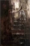
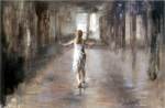
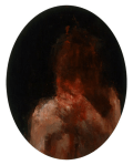
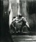
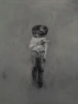
Philip Govedare, “Project”

Just last week, I wandered into the bedroom which faces south and caught a glimpse of the last rays of sun moving across the fields behind my building. The fields are actually a dumping ground for every rejected item possible, from furniture left out in the rain, shoes and boots, broken televisions, plastic cups, deserted laundry blown from the lines – all of it just dumped, trampled upon, mowed over or around. Some people even bulldoze all of the refuse into mounds and set it on fire twice yearly, but it seems to be more of a bonfire activity for teenage fun than the result of absolute repulsion, with burnt patches of earth remaining as testimony. Beyond are makeshift huts used as homes, utilizing aluminum sheets, broken fence pieces, abandoned doors and warped wood. Further beyond there might be a little less despair, but given the distance and the light, I cannot see it. This is the reality out the window, if you really look at it, and no matter how far I walk in any city in this country, it seems unending. I sometimes feel so overwhelmed with hopelessness, but no one else seems to be in agony.


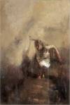
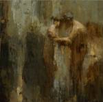
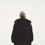
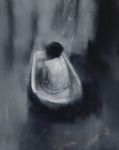
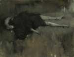
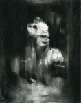
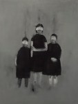
Claire Sherman, “Cave IV”

But, as a painter, when looking out that bedroom window at those rays grazing across the field, I was not enraptured by the idea of painting the scene of “what” was out there, but of painting the experience of looking out the window at that moment, at that split-second of seeing those colors and feeling them enter my bloodstream.  At mixing those colors and seeing them side by side, even in an entirely abstract composition. I wanted to eat them, gorge myself on them, they looked so delicious.


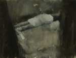
Kevin Marc Bernstein, “Aggregation I”

This then made me think of a conversation I had not too long ago, when a scientist friend asked me to describe what I meant when I said that the basis of figurative painting is abstraction, and how exactly so. This question came up after discussing other painters, but was in reference to the way I paint also, which can appear less “abstract” certainly. I explained that, in order to appreciate art that is more or less abstract, one must have the eye that enjoys abstract forms, and this is a joy that is instinctual yet can be fostered. An abstract form is an isolated form with a certain size, shape, color, texture and edges that has no meaning other than its own qualities of size, shape, etc. However, this abstract form takes on meaning as soon as it is in the context of another abstract form; these amoeba-like forms build meaning through their juxtaposition. And an artist has control over how much attention they give to its qualities, and less control over how much they can actually see. The best part of painting – for me – is oozing around in this mode of seeing and gripping abstract shapes.


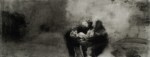
Susan Lichtman, “Winter Interior”

The meaning of forms can simply be a tension between them, or a dependent relationship within a composition which can affect the viewer, but it is always (in my opinion) a desire on the part of the artist to create a significant meaning, an “important” relationship of forms, which cannot be put into words, but is about the experience of human perception, of being there and being moved by this composition of elements. The artist can also, through the continued observation of the color, texture, edges etc of these forms, build an illusion which to our eyes appears 3 dimensional, and when this happens, the artist is particularly interested in giving new meaning to that figure/object/scene which appears. From a distance, the edges between these individual abstract forms can appear in varying degrees of hardness and softness, which have an effect on their appearance in space, in terms of what pops forward and what recedes. The color and value of these forms works the same way in this nature of observation/perception, in that light and warmth come closer to the eyes and dark and cool distance themselves. It all depends on how much the artist wishes to create the illusion of 3 dimensions, wishes to remain in the flatness of beautiful forms, or wishes to enrich one subgroup of what’s out there, for example the chroma, the edges or the tone.


Matt Klos, “Kitchen Window, Nightfall”

Perception is also an embedded element in figurative art. Everything out there can be seen as abstract forms, but perception is what allows for a human feeling to emerge related to them. Human beings are equipped with organs that allow perception, the sensing of light, color, warmth, dimension, texture and so forth. The process of looking at something or hearing something cannot always be separated from the feeling it gives. It is not only cold calculating of size, length and color mixing, for how would we explain goose bumps and shivers when hearing a story or thread of music. Our brain causes our skin and blood to react. These are perceptions that we cannot actually control, and so all of them are not only valid for inclusion, a true human painting cannot be created without them.


Daniel Enkaoua, “Le Melon et la Pasteque”

What makes figurative art based on abstraction and perception so difficult is that the parameters are so wide for inclusion and failure. Everything is open for observation, and everything is open for impending doom. Some artists focus purely on the forms that are out there, and others focus on a human concern to them. One can imitate, be repetitive, have good luck or bad, get stuck in reportage, overboard on feeling, lack a crucial element, have no important focus, or simply have nothing interesting to “say.” The artist can choose to not give a hoot about the qualities of the abstract forms and simply plop them down, or he can care to a great extent about every part of them. Great art can be said to cause the viewer to somehow become a better, more whole human being through an increased coming-to-grips with what might be out there and what might make this walk through life more valuable. By experiencing a scene made up of cared-for components, in a composition which provides non-verbal comfort, the viewer can soak up a small beauty in abstract, perceptual reality and therefore share in this visual awe about what real can be.  A bit like having someone come in and remodel the entire backyard.


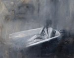
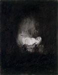
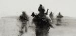
Vincent Desiderio, “Sleep”

But painters when painting are not usually thinking about the aftereffects of a possibly “successful” painting. When I get stuck about the “why” of painting, there is no one to give an answer, offer advice or provide comfort. No one is forcing me to pick up a paint brush. When I get stuck on the why, I think, and this might lead to new directions and explorations, so that the challenges change. But I turn to the works of others, especially new ones, like I look out the rear window: for a fresh rainfall of unexpected perspectives, a good douse of something that’s good for me amongst all the drivel.


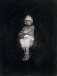
Eve Mansdorf, title unknown

A Holiday Feast of Paintings


Telemaco Signorini, Il Quercione alle cascine, 1862-66, 35.5 x 45.5 cm

Two lovely ones from Fausto Pirandello:

Felice Carena’s “Corsa dei sacchi/Sack Race”

A Constable:

A Chardin:

A Levitan:

Sophie Jodoin:

Best wishes to all for a most happy holiday and a new year of beauty and delightful surprises.

Theory Schmeory

My “art education” apparently started at a very early age. 5 to be exact. I was in kindergarten and once a week we had time set apart to do art. Artsy craftsy is a more appropriate term, but I reveled in it. I remember with sincere fondness the sequins I chose to adorn my paper crown of David, the pipe cleaners for the crown of thorns, and the colored cotton balls I carefully glued down on my lamb of God. (Yes, I was sent to a small private Lutheran school, ugh ugh. During my nine years there, we did many art projects, mostly secular rather than religious though)

One day, however, the teacher decided to give us an introductory Lesson on Real Art Theory. She pulled out the papier mache balloons we had made from the time before, and explained that we were going to pop the balloon inside and cut the form into a flower. I remember trying to carve petals carefully with the scissors. She then pulled out pots of red, yellow and blue paint, and asked us to choose one. I chose yellow.


Egg, painting by Duane Keiser

Then she pulled out pots of green, purple, and orange paint, and assigned each of us the Complementary Color of the Primary Color we first chose. I received purple.


Hole No. 2, painting by Emily Eveleth

She then instructed all eight of us to mix together our primary color with the complementary color and use this mixture to paint our flowers.

I was crushed, I remember it well. I mixed the two together and out came this sludge, this brown bubbling mass that had lost all sense of the beauty of yellow and purple. I wondered how on earth it was fair and right to cover a delicate paper flower with dirty paste. And following the teacher’s orders, I and the others painted our flowers with this fudge which recalled anything but chocolate, though I tried really hard to see it that way. I looked at my brown flower with the greatest sadness, and then looked up. The entire room was filled with brown paint. I was surrounded by shit, and I was deeply upset.

This drawing below is one of the few that I have still have from youth. We had a swingset in our backyard, decorated with overlapping circles and a bit of rust. I loved it (I still go on swingsets when noone is looking), and so I drew it. We did not have a pond, but a kiddie pool, and the colored autumn leaves and dyslexic date show I would have been 6 years old at the time. Not long after the complementary color lesson therefore, and yet there is no sign of that important lesson in Art Theory being applied here. Thank goodness. This was just me looking, trying to get the feeling that the two-seater swing was at an angle, giving each leaf its color and shape, the chain its rings. The part that surprised me, though, is what I found on the back. If you look carefully, you can see through the paper that I had started this drawing on the other side, putting the horizon line right in the middle. I must not have liked it, so I started over. This was a matter of preference, not a learned rule, of something not seeming quite “right,” that the sky was further up and so I needed more space.

Perhaps ever since the brown flower episode, I developed a mistrust of institutional art education. Many years later I tried studying further, in high school, university, privately and at an atelier, but I always felt alone and defiant, knowing that I was committed to drawing and painting what I believed was truthful and not because someone else told me so. I preferred to investigate things myself, to try to see deeply on my own and not because I was supposed to see something. To this day, I have yet to observe a brown and say to myself, “Ah, I see yellow and purple.” Browns are infinitely richer than a formula.